Looker
Looker
Data Analytics Platform

Project Name: LENS Design System
My Role: Design Lead
Tools: Figma, Codepen, Git, Markdown
Team Members: Jared Hardy, Nate Agrin, Steve Mahoney (engineeers & PM)
Duration: 9 months
Overview: Establish a centralized contribution based component library and design system
Phase 1: Heuristic Audit
Cataloging, naming, and IA by establishing a baseline theme for the component library and design system.
First we set out to create an internal audit and establish the overall health of the UI elements throughout all the product domains. This helped prioritize and better understand the ecosystem of our current front end state. Through this process we found that there were thousands duplicated styles of colors, sizing, and type treatments of the UI.
There were some big challenges… It was very important to establish the terminology and language in an agnostic way, which could be used to map over the new designs to the existing UI elements. There were many rounds of discussions about syntax, workflow, and what would constitute a low or high level component.

Phase 2: Building Components
Our next goal was to take a set of low level components and styles and begin to create a workflow and process that could be used as a template. In order to better understand the team we performed interviews and feedback sessions to gather insights around the current process. As predicted we found that most of the teams were copying and pasting code or recreating assets from scratch duplicating their efforts.
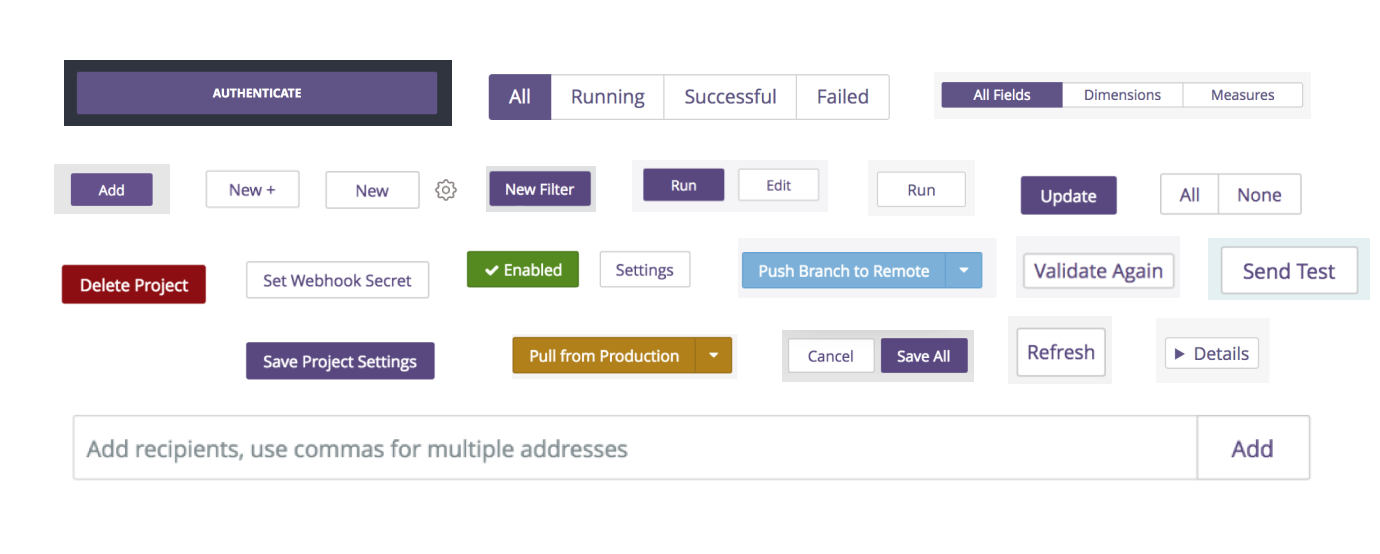
Here is an example of a card and elevation component:

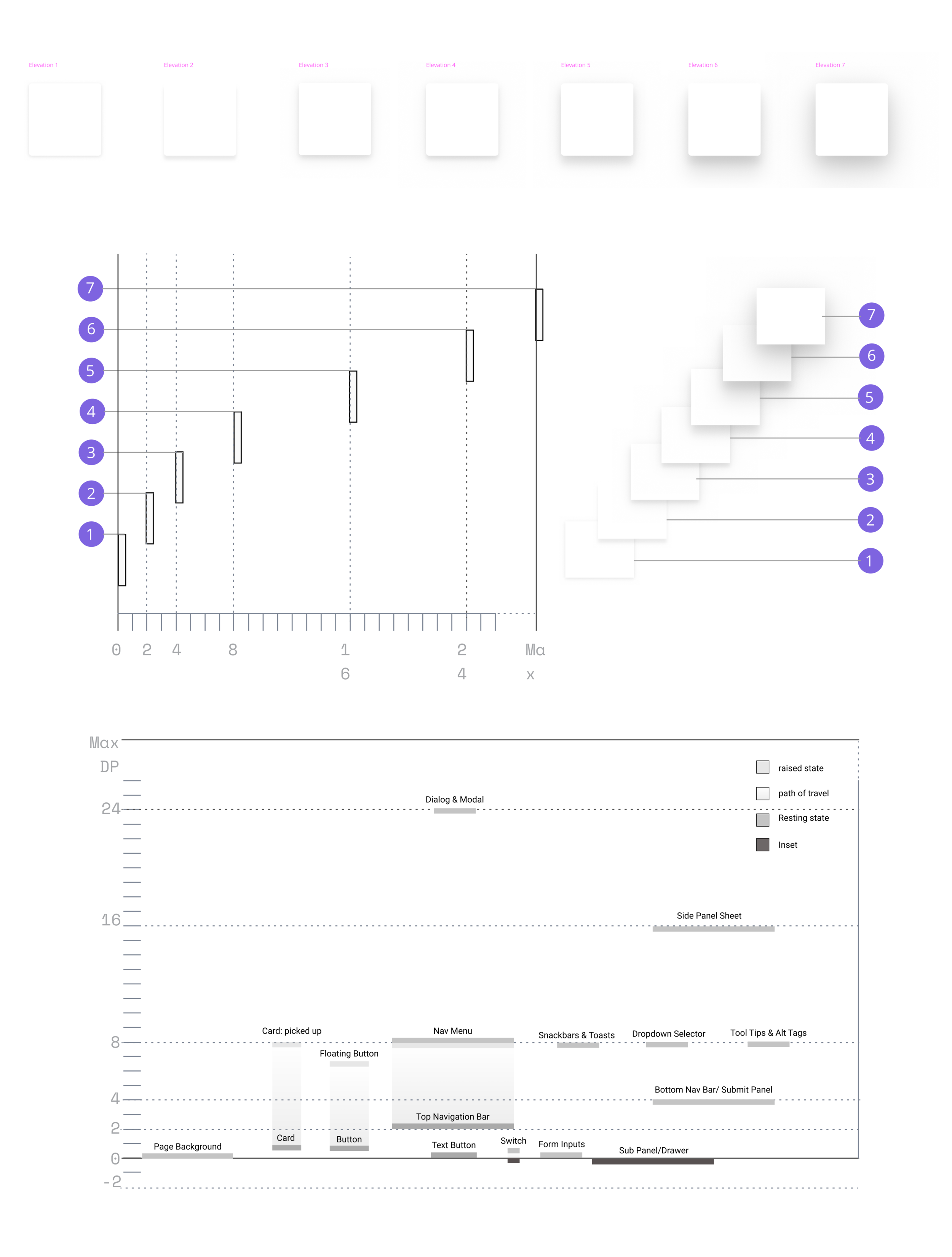

First to be built were the lowest level or reusable styles: colors, type, size, icons, elevation, and grid layout .
Next, Smaller components with behavior states: Buttons, Inputs, Checkboxes
Followed by: Higher level components: Cards, Layouts, Forms
We begin to establish a centralized source of assets within a component library that could then be shared back to the team and incrementally rebuild and replace these components back into the product codebase.
Phase 3: Contribution Model

The main goal of the design system is to be used by the teams and building it into their workflow.
Getting folks to use the design system was the biggest challenge.
On-boarding the teams to use the design system took time and education. We provided open office hours, workshops and webinars to help provide assistance. We created a checklist and templates to follow as well as embedded adoptees into the teams as experts.
The component library was designed to be contribution based process, allowing the engineers to extend the low level components for their needs and then share it back into the component library.
Designers also needed a way to contribute by applying prebuilt styles and assets in Figma that matched the codebase components.
Phase 4: Theming
In order to successfully redesign the product, we first had to create a theme that matched our current look-and-feel, so that we added it back into the current product, no one would really notice it. It was important to map all the design tokens and match the old theme with the new style attributes. The components then could then turn on the new styling in a more manageable and seamless manner.
Themes also provided an opportunity to allow our customers to customize their individual instances with their brand specifications.


Once we had an future goal set we could then begin to map out the themed versions into phases and baby steps. This phase approach would be much more efficient to implement over time and allow us to iterate and validate each step of the way.

In addition to improving the product, this also opens up opportunities to customize the product. This can be something as simple as a dark mode light mode. And even provide a way for our partners to theme their instance with there branded colors.

Project Name: Looker Thesis
Duration: 3 months
Overview: Use the product, build a dashboard, and presentation
One of the most fun projects was a ‘use the product’ thesis, it was a chance to build something with looker and share with the company. First there was research.. what did I want to build? What story did I want to tell? With the help of a mentor I found a dataset that I connected to.
I chose a data set around cost of living through a public data set provided by Zillow and joined it with a USGOV poverty index within the US.


At first it took some weeks trying to get the model built correctly..

Once I saw how I could build a story and share the dashboard with others it felt like magic. I could built a dashboard and share it with customized filters that allowed anyone to enter a city or state or zip and compare cost of living and poverty.
The next part of the project I wanted to see how I could take these filters another step and reach an audience though narrative story telling. The concept was to embed visualizations into a blog or article. Any one reading the article could then click on the highlighted text and switch or change the filters to explore the data in their own way.

During the entire process I kept a project journal, writing down pain-points, successes, failures, and the emotions of every step of the way. This is what I ended up presenting, the journey. How we all work furiously to fix a bug or add a new feature… these things are very important, but we all need to remember the emotional side of our customers experience. Maybe they’re sitting down for the first time or perhaps after some time away. I wanted to remind everyone of how it felt when they first started using the product and the joy when things just worked. It felt like magic. And all those ups and downs of their journey can give us real insights to what we should be focusing on when making improvement.
Conclusion: Data is dirty. If given the choice to redo the project, I would have chosen a data set that was more complete and consistent.
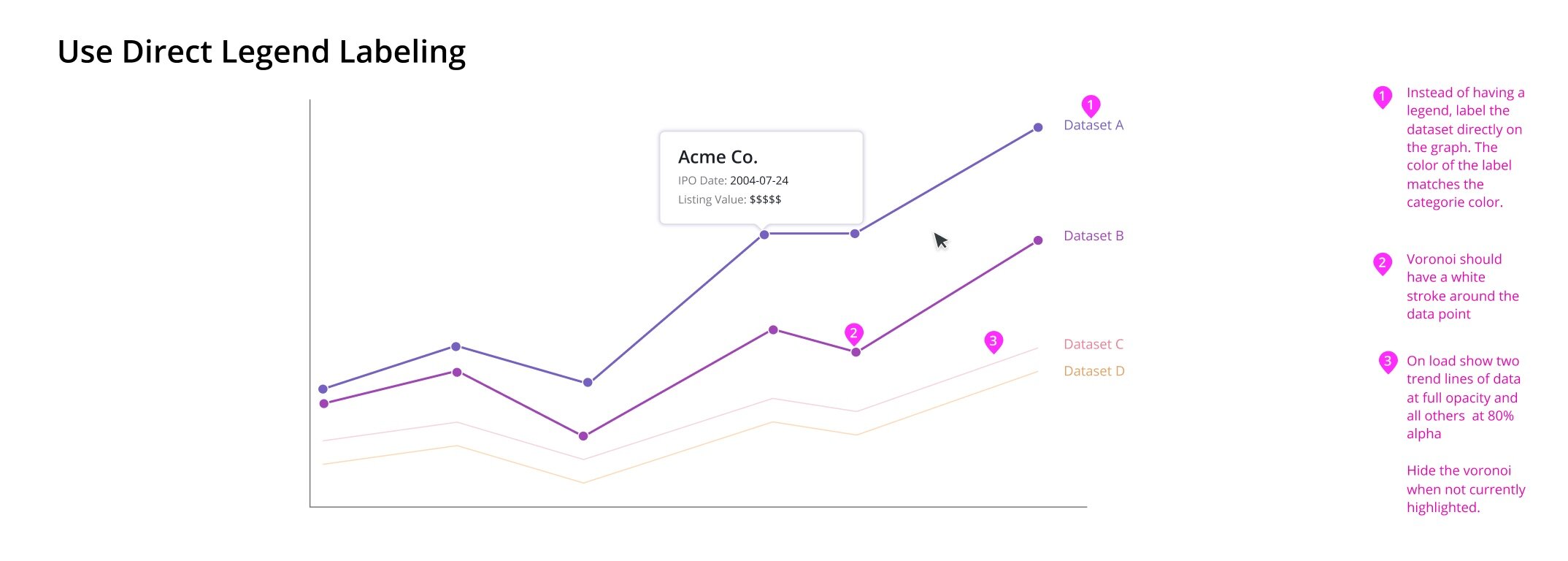
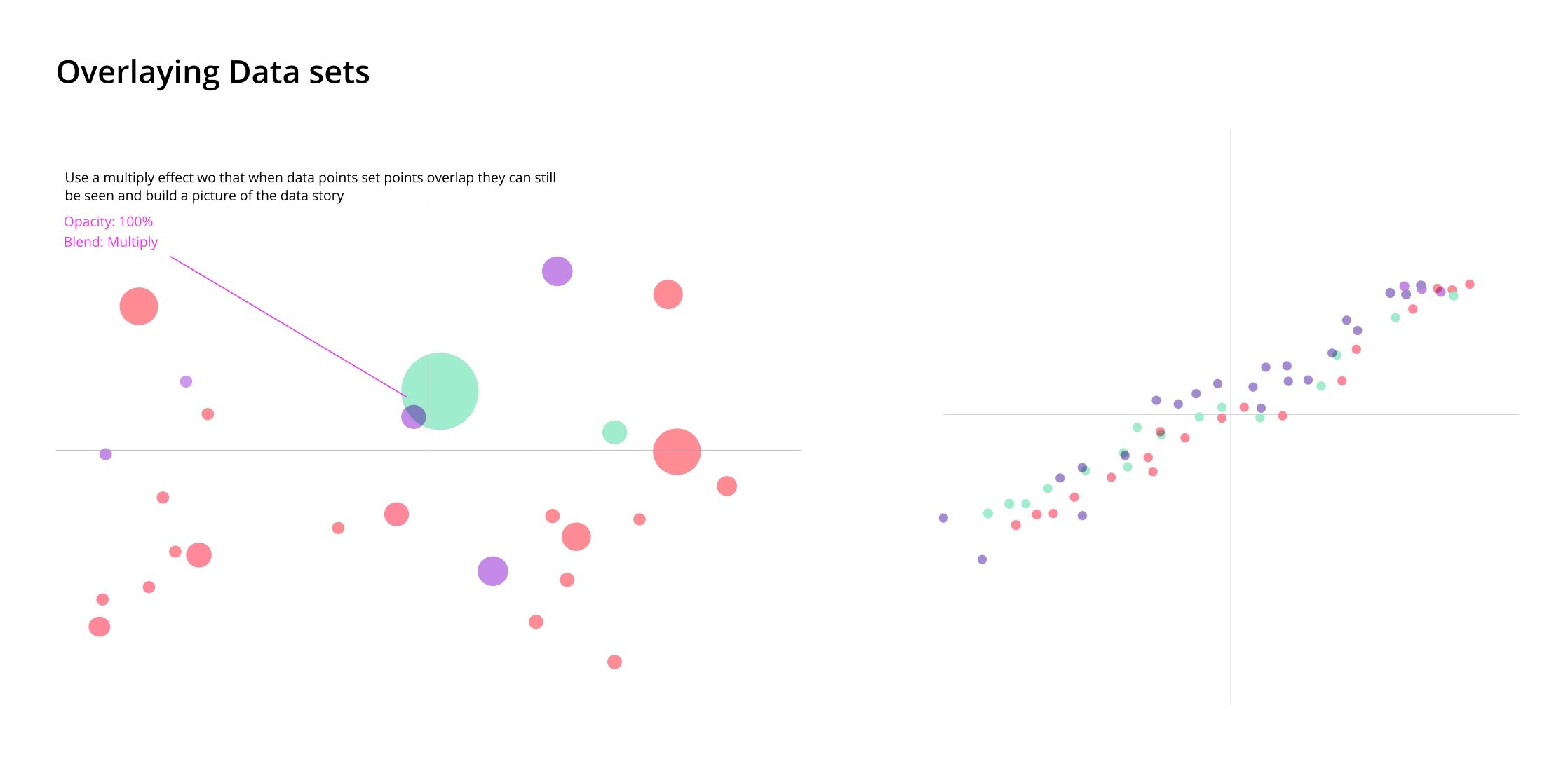
Project 3: Data Visualization Palettes
My Role: Sr Product Designer
Tools: Figma
Team Members: Todd Schomer, Sarah Waterson (designers)
Duration: 3 months
Overview: Develop new color palette themes and delightful defaults for data viz
Phase 1: User Research
Gathering insights and learning about how our users build visualizations in the current state of the product helped us frame the problem and get to the core root of the users intentions.
Findings showed that users didnt want to spend a lot of time tinkering with styling or editing palettes.
One big frustrations was that users were unable to set a palette once and save a theme, instead they would need to had set each and every chart manually.
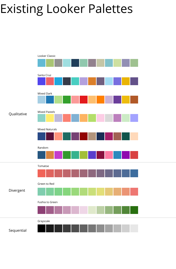
Here an example of the color pallets and how they were being applied in the current state.

The Problem: User pick a palette for their visualization that does not provide a distinct difference between the two sets of data.
The Expectation: When a color palette is selected it should automatically apply the correct default settings based on the cart type.
Project Goals
1. To engage uses with a delightful aesthetically pleasing experience that is on brand.
2. Communicate quickly the patterns and relationships within the complicated aggregate of information.
Secondary Research:
The first step was to research perceptual color space and HCI findings on how color can semantically impact the way we read data visualizations.


Phase 2: Explore & Synthesize
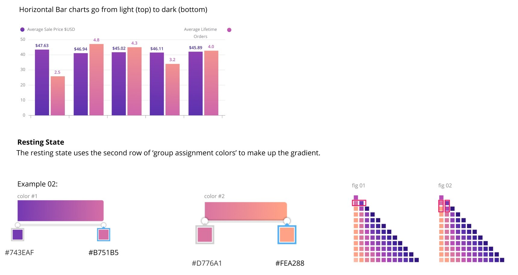
Next I developed a series of new palettes to test and build with in the product. This gave us a set try and see where we could improve defaulted chart assignments. Here are just some of the new palettes that were adopted.
Visited the full color collection list here:


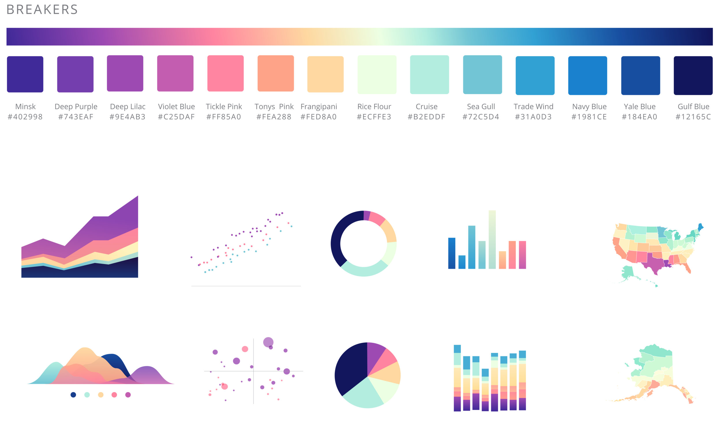
The challenge was that we didn’t have a lot of insight into how the charts were built and the logic behind the date set assignments. We had to try and fail many times to optimize them iteratively and by adding them into the build to see what would break. Heres some examples of how the new pallets would look within the product ecosystem.

On a Dashboard

Boardwalk palette in the edit side panel

Example of Sunset palette applied to a dashboard view
Santa Anas palette was found to be too dark and was cut.

Oasis palette made it into the collection.
Phase 3: Delightful Defaults
As we discovered the way in which our charting components were applied there was a chance to add in a few other usability improvements. Here are some snippets of some color assignment logic usage proposals.

Conclusion: After many rounds of testing we released 12 new sets of delightful new pallets and charting defaults.
Takeaways: A simple project grew very large very fast and we learned to scope back by breaking up each chart into its own epic.
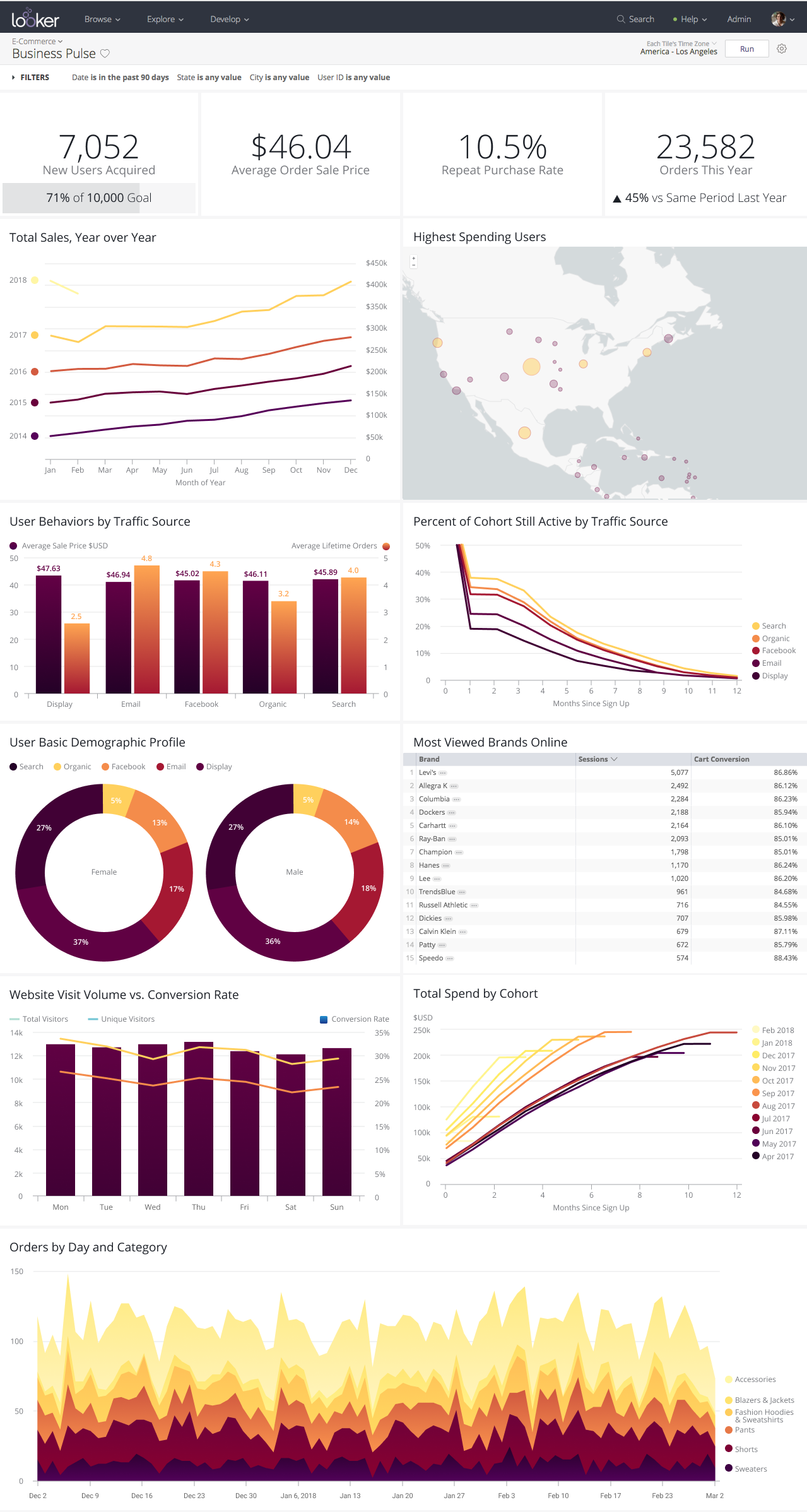
Project Name: Dashboards
My Role: Product Designer
Tools: Figma
Team Members: Melissa Boucher, Todd Schomer, Sara Waterson (Designers)
Overview: Dashboards are the bulk of the product and the goals for this project were to revisit and improve the creation and viewing experience.
Phase 1: Explores
What is the problem we are trying to solve?
Improve the hierarchy for visual scalability to help speed up the time for a business user to find a specific piece of information .
Goals: Create dashboard templates for different user personas
Users needs to quickly identify and understand problems and resolve issues efficiently
Personas: We built a few personas and created scenarios for this project.. all of which were viewers only and not creators of dashboard. This way we could work backwards and break the project up into two distinct epics.
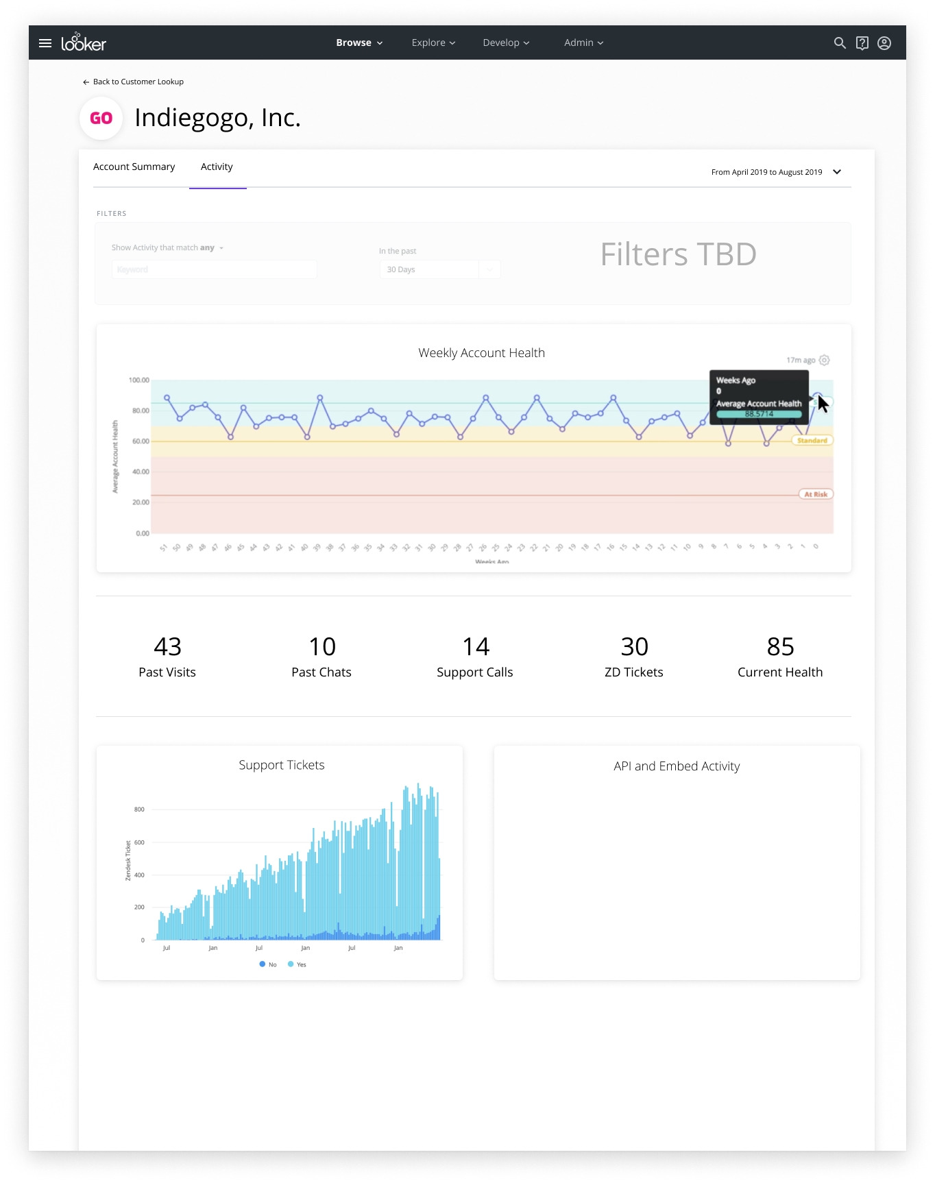
Example Scenario: Customer support rep is on the phone with an unhappy customer.
To provide the best service, the rep wants to understand more about that customer’s history with the product, the version they are on, and other important business context like MRR and previous support tickets
They go to their customer lookup dashboard and start typing the customer’s name. They don’t know what the exact name is in the database (whether it’s capitalized, has ‘Inc.’ at the end, etc), but the dashboard takes their input and finds the correct account.
They have the customer on the phone, so it is critical the dashboard loads quickly as to not keep the customer waiting
When they arrive at the dashboard, they can see the customer’s product history, account details, support tickets -- the entire 360 view of that customer so they can more accurately diagnose and handle their problem
Secondary Research: Another part of this phase is performing audits of the existing experience and gathering insights on whats working or not working well from our users.
In this example Im outlining the padding/spacing and the use of white space as it pertains to visual heirachy.

Phase 2: Storyboards, Wireflows & Ideation: Exploring different journeys and flows provides a wholistic view of the experience. Paper prototypes become journeys which become wireflows.


Phase 3 - Mid-Res Prototypes: Once we have a general idea and direction I create mid-res prototypes to test with users (moderated setting) and provides insightful feedback needed to make a solid proposal.

Phase 4 - Speccing: I provide additional anatomy, naming, states, behavior and usage that may be needed for delivery and proposes on how to build out the components with engineering.

Phase 6 - Ship and Test: We create a beta and test with users, gather feedback and measure with qualitative surveys

🎉
Conclusion: This is only the beginning .. we take our findings and iterate on the next round until we have a feature that is ready for the general audience.